Frictionless Checkout
Improve loss prevention for grab & go food shopping
Skills
Competitor Research
Wireframes
Mockups
Design Presentations
Vendor Collaboration
Collaborators
Product Manager
Content Strategist
Engineers
Vendor Team
Tools
Figma
Current State
The current solution allowed students and employees to check-in to grab & go food markets using NFC capabilities in their phone. Before holding their phone to the scanner, users would select the appropriate market and their desired payment method. They were then free to select their items from the market and leave while the transaction would complete in the backend.
The issue with this method, was that it allowed users to check-in to the market regardless of the current balance on their selected payment method (which resulted in a negative balance), or pretend to check-in by holding their phone to the reader and then take things from the market without paying for them.
Ideation + Execution
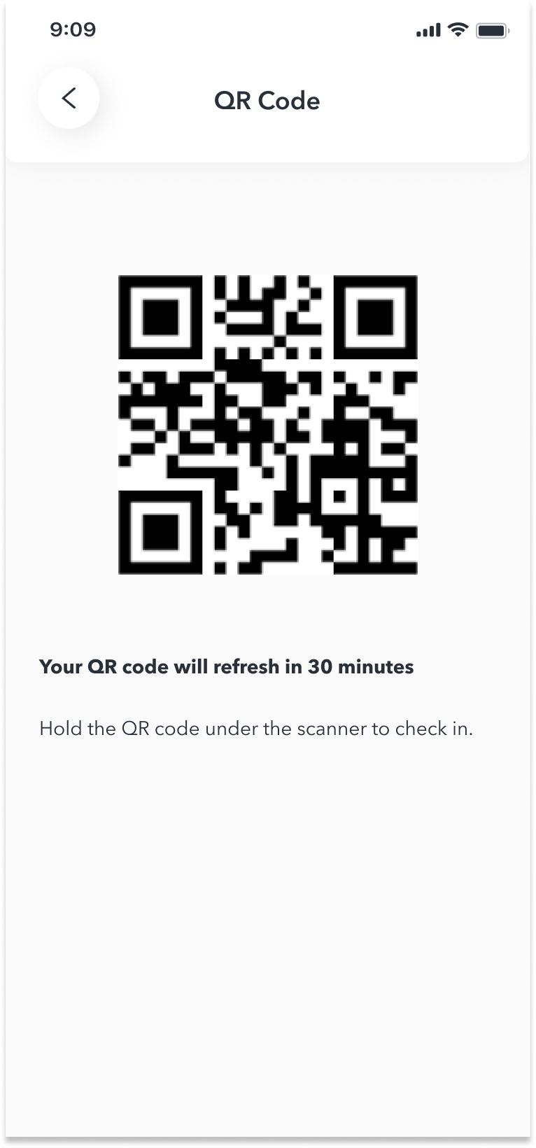
To help our clients with their loss prevention efforts, the check in process was getting updated to use a 'kiosk’ that would scan a QR code and provide visual and audio feedback to users and any staff at the market regarding the success of the check in.
When designing the experience for this new check in process, I leveraged as much of the existing designs from the NFC check in experience as I could so that it was familiar to the users and would minimize confusion and friction as much as possible while they adjusted to the new check in method.
Final Designs


Challenges
The biggest challenge we faced with this feature was how to handle the scenario where a user trying to check in to a market had an insufficient balance.
We knew from the time of the API call to create the QR code whether or not a user had sufficient balance, and the design and product teams wanted to surface this information to the user as soon as possible (i.e. before generating a QR code) to avoid unnecessary friction and frustration. By forcing the user to choose a payment method that had a sufficient balance to check in before generating a QR code we wanted to achieve the following:
promote transparency and build trust with the user by being upfront and clear about an issue
avoid unnecessary repetition of QR code generation and steps taken on the kiosk to check in
avoid potential for increase in wait times to check in at peak hours
avoid potential embarrassment for users at having their lack of funds announced to anyone in the area
Unfortunately there were key stakeholders that insisted the insufficient funds error needed to be surfaced on the kiosk and not in the app. After advocating for a better user experience to the vendor and technology team, we were able to come to an agreement that for the first iteration we would launch with the error showing on the kiosk and pay close attention to any feedback from users about the new feature, and consider improving the experience for future releases.
Short term solution
Because we were unable to sway the decision in time for launch, I also adjusted the designs so that the current balance of the available payment methods was surfaced. The thought was that if the user could see that they have a low amount of funds available on a payment method, they might choose and different one or add funds before generating the QR code and avoid getting an error when trying to check in.
Showing this data to the user was an improvement that had been made elsewhere in the app and, thankfully, after discussing the idea with the developers we realized we had the scope available to surface the data in this feature as well.
Disclaimer: The content shown in the images is not real and has been subbed in to protect proprietary information.