Intranet 2.0
A clunky, unorganized intranet that doesn't help users achieve their goals
Skills
User Research
Information Architecture
Wireframes
Mockups
Usability Testing
Executive Presentations
Collaborators
Manager of User Experience
Business Stakeholders
Copy Writer
Vendor Team
Tools
Sketch
Google Suite
A clunky, unorganized intranet combined with an over-worked Communications and HR departments forced to field a seemingly endless stream of questions whose answers existed on the intranet (but weren’t discoverable by users) made for massive headache all around.
The previous iteration of the intranet was built on Sharepoint and, on the surface, had become aesthetically out of date but it also suffered from much more fundamental issues:
The information architecture (IA) didn't make sense to users, making it difficult for them to find the information they were looking for.
The search function didn't work properly making it even more difficult (or nearly impossible) for users to find information.
The left-hand navigation changed depending on which page you were currently on, had too many items, and didn't seem to be in any particular order.
In order to access the site, users had to be connected to the internal network, either with a cable at their desk, or by using a VPN. This also meant it wasn't accessible on mobile devices.
A lot of content wasn't being updated on a regular basis, leaving users wondering about the validity of the information that was there.
Any content that was updated regularly was also sent out to employees via email, giving them very little reason to go to the site and try to find information on their own.
Research
Another challenge the previous platform presented us with was that there weren't any metrics being collected. We had a hypothesis that very few people were using it based on anecdotal evidence and our own frustrations with – and abandonment of – the platform but there weren't any numbers to back this up. So our first order of business was to try and find out the extent of the problem as well as what employees would ideally like to see on their intranet. We did this by sending out a survey to all employees and asking for the following information:
Where they were located and what kind of position they had with the company (individual contributor vs leadership)
How often they used the current intranet and what they used it for
Their level of interest in certain features being included on the intranet
How well the current navigation worked for them and how they thought it could be improved; and
How they felt about the intranet overall (rating of their overall experience, what they liked best, what they liked least)
After collecting feedback from approximately 400 respondents (slightly less than half our total employee count) I analyzed the data to figure out what the biggest pain points were for our users, what they needed to have on the new intranet, and what could be added to increase their enjoyment and engagement with it.
The biggest pain points were:
It was hard to navigate & they couldn't find what they were looking for
The non-functional search function
It looked outdated
They couldn't access it from outside of the office or on mobile devices
There was an overload of information that wasn't useful or was out-of-date
It was primarily focused on Canadian employees and didn't offer the same level of content for employees in other locations
Information was buried in layers upon layers of links
Things they needed from the site:
Access to service vendors (benefits providers, vacation booking, etc.)
An organizational chart that was up-to-date with employee contact information
Information about the company (news, events, initiatives, information about areas of the business, etc.)
How-to guides for internal processes (i.e. how to call in sick, go on maternity leave, etc.) and onboarding documents
Easy access to commonly used resources (templates, policies, etc.)
A good search function and a better organized site
To be able to access it from anywhere
In order to make sure we were satisfying the needs of both the end users and our stakeholders, we held meetings with representatives from key areas of the business to discuss what kind of information they wanted to be able to share via the intranet and what they thought people should know about their business area. We also conducted a number of workshops with key stakeholders to figure out the information architecture of the site.
User Goals
Given that the company is rather large and contains a diverse set of users, we opted to not define user personas and instead move to identifying key goals of users accessing the intranet. In addition to identifying current goals of users accessing the intranet, we also identified new goals and behaviours that we aimed to encourage with the new site.
Existing goals:
Looking someone up in the organizational chart/finding their contact information
Accessing vendor platforms (i.e. benefits providers)
Learning how to do various tasks associated with their job (i.e. booking a vacation, submitting expenses, etc.)
Accessing commonly used resources
New behaviours:
Learning more about the company and the various business units
Getting updates about the company and the industry (any company or industry news was previously sent out to employees in mass email communications, the HR and Communications departments wanted to move to a self-serve model)
Ideation + Execution
After analyzing the results of our survey and conducting workshops with stakeholders we were able to determine which basic elements would be included on each page (i.e. an about section, key contacts, G+ communities, resources etc.) and give content templates back to the representatives from the different areas of the business to fill out.
Since we were on a pretty tight timeline to make our ideal launch date, we decided to start sketching and doing low-fidelity wireframes in tandem with content being created. This did lead to a fair amount of rework for the wireframes when the content did finally come in, but we were able to settle on layouts that accommodated the varying length of each of the content sections between areas of the business.


While we could have taken an approach where the layout of the page was adjusted for each business unit depending on the amount of content they had for each section, it was more important to us to create consistency in layout across the different business unit pages so that users could easily find the information they were looking for. We wanted to avoid giving the impression that we had simply lifted and shifted the content from the old platform to the new one, as that would make the users feel that we hadn't listened to their feedback. As such, we were very deliberate about creating reusable templates for the different types of pages that still met the needs of the business units.
Final wireframes


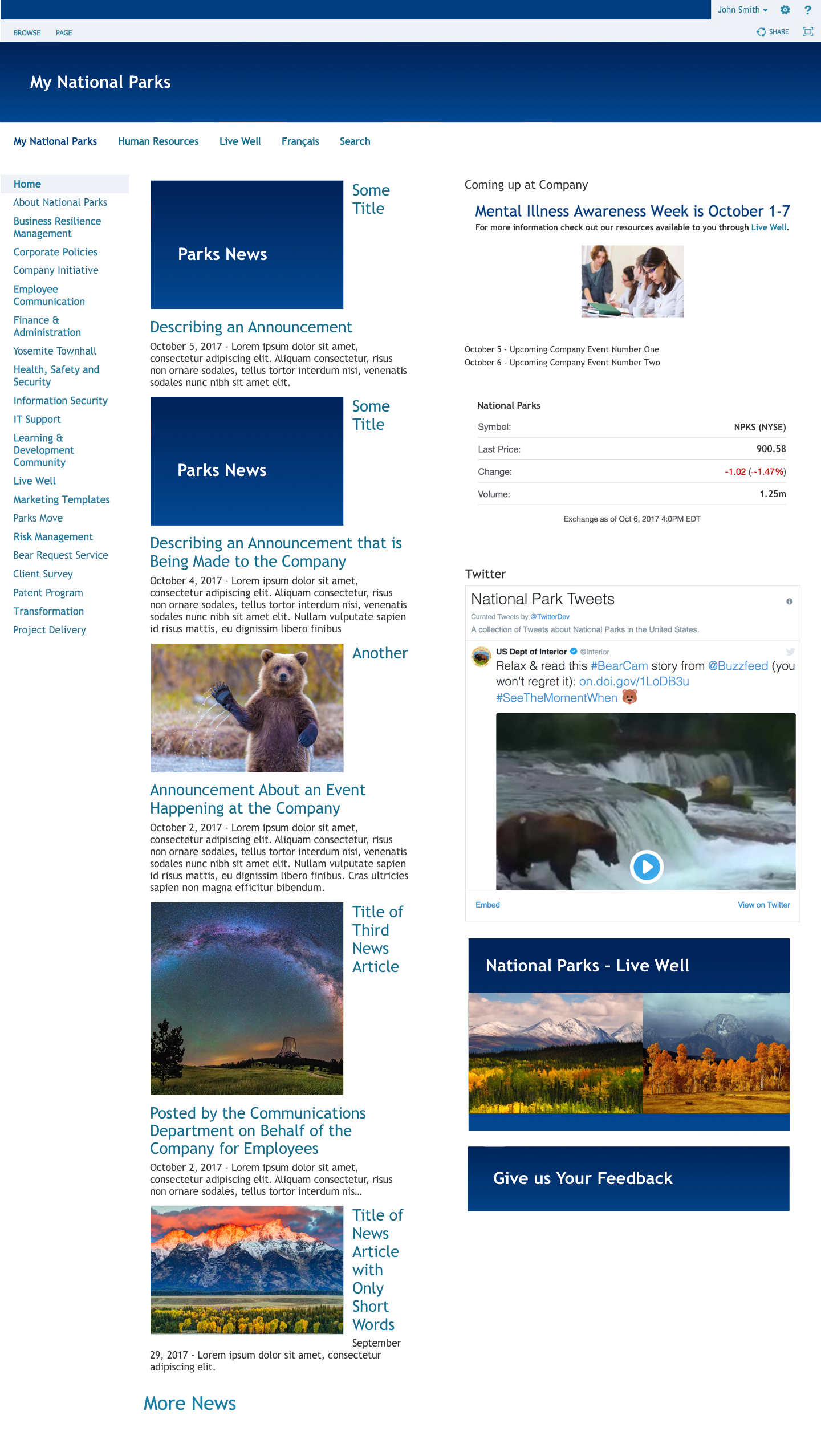
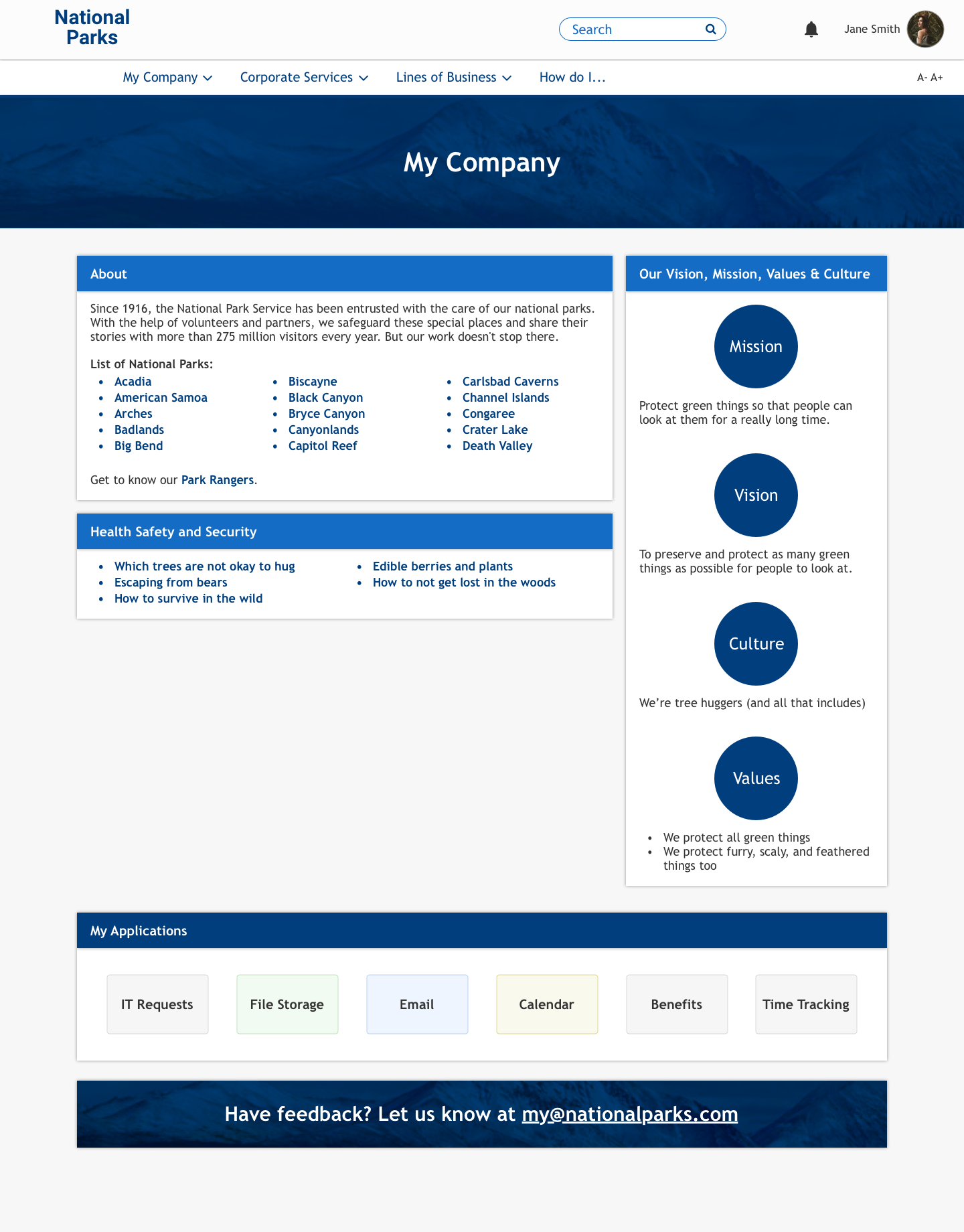
Company Overview


Homepage
Corporate Service template
Line of Business template
After the wireframes were finalized we handed them off to our vendor so they could begin implementing the basic layout of the pages and start inputting content. Our next step was to get approval from the project sponsors and our head of marketing for our visual design direction. To do this, I mocked up potential design directions to be used on the homepage, checking in for design critiques with my manager and iterating on the best concepts. We presented the three strongest options and our recommendation to the project sponsor and head of marketing and got their approval to proceed with our recommendation. Once we had received our final direction, I created mockups for the rest of the page templates and handed them off to our vendor.


During the implementation, we ran into some obstacles due to some limitations in the way the platform's components were built. We were able to work with the vendor to either refactor some of the elements or come up with creative behind-the-scenes solutions that maintained the front-end experience for the employees. Even though the site wasn't exactly the same as the mockups, we were able to achieve a much more organized and modern site than the previous iteration without adding too much custom .css that would potentially cause issues in the future.
Testing
UX was still new to the company, and we often had difficulty convincing stakeholders that testing is a valuable use of resources. Fortunately, we were successful with the stakeholders of this project and we were able to block off time for user testing towards the end of the project. Having to do testing immediately before a scheduled launch isn’t an ideal situation but it’s better than no testing at all.
Our testing used both individual, task-based user testing and a pilot group. We were very mindful of selecting employees from a variety of locations, seniority levels, departments, and native languages when creating our test groups to give ourselves the best chance of catching issues that could affect our users.
Our individual testers were given five tasks to complete that we felt would take them across a fairly wide range of areas on the site and allow them to test out a number of new features we had implemented. Our pilot group was given very general instructions to use the site as much as they could over a period of three weeks before the launch. At the end of each of the three weeks we asked them to fill out a survey which asked them about their general experience, whether they had found any errors or things that had been left out, and their thoughts and preferences about specific features.
Through both the pilot group and individual user testing we were able to identify some issues (mostly based around the terminology being used to describe certain areas not resonating with employees) and fix them before launching the site to the rest of the company. The feedback we received from both groups was overwhelmingly positive and they felt that we had done a great job of redesigning the site.
Final Designs
Though the first thing the users might notice about the new intranet might be the updated visual design, the most impactful change we implemented was redoing the information architecture (IA) and changing how information was organized across the site.
Some of the more significant changes to the information architecture included:
Creating consistent layouts for pages that contained similar content so employees would know where to look for certain types of information (i.e. contact information for departments) and therefor make accomplishing their goal easier and faster.
Surfacing content in new ways (i.e. having multiple tabs on a single page instead of multiple pages) so that users didn't have to click down through numerous levels of links to find the information they were looking for.
Creating centralized locations for types of files and information that all employees need to access (like FAQs) so that users always knew where to find this kind of information. These are also referenced in related areas and link back to the central location so that users have multiple ways of finding the same information (i.e. there is a dedicated page for all FAQs, but a user can also find FAQs about finance listed on the Finance page).
Showing information that was important to a wide audience and changed frequently (company and industry news, events, stock price) on the homepage so users wouldn't have to go digging for the most up-to-date information.
Organizing the rest of the information offered on the site into four main categories that made sense according to our employees' mental model of how the company was structured and what their primary goals were. Structuring content in this way also served to equalize the different areas of the business. Previously, areas of the business – such as HR – were given ample space and a higher priority while other areas of the business had very little or no space at all. By creating space for all the main areas of the business, it fostered employees' knowledge and understanding of the business as a whole and encourages collaboration between business areas.


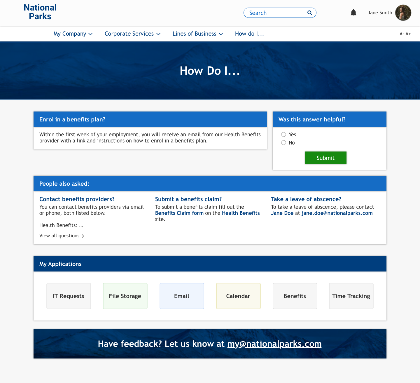


Other features that we implemented to better support our users included:
A search featured that actually works.
Integrating our Google for Work suite of applications, like the company Drive folders so that files only had to be maintained in one location.
An interactive employee directory that showed reporting structure as well as each employee's contact information. We were also able to work with our vendor to link this directory to our HR department's database of employees so that it can be automatically updated with very little effort on a regular basis instead of having an employee spend time re-creating a clickable PDF every few months.
Grouping content into card-style widgets to keep the pages visually organized.
By collaborating with key stakeholders and our vendor throughout this process we were able to deliver an intranet site that is well-organized, has relevant and up-to-date content, looks good, and most importantly allows users to accomplish their goals.
Results
While it's difficult to know the exact impact of our redesign because there weren't any metrics from the old site, the metrics that have been collected from the new intranet so far are encouraging (the site was launched a month before publishing this and the company has approximately 1000 employees).
500-700 Daily Users (on weekdays)
1500-3700 Page Views/Day (on weekdays)
61,917 Total Page Views
45.76% Average Bounce Rate
14,269 Total Sessions
4.34 Average Pages/Session
3:59 Average Session Duration (min/sec)
Disclaimer: The content shown in the images is not real and has been subbed in to protect proprietary information.