Personalized Buyer Experience
Transform a generic marketplace homepage into a dynamic entry point, leveraging data to create a personalized experience for users
Skills
Requirement gathering
Competitor research
Wireframes
Mockups
Executive presentations
Collaborators
Product Manager
Manager of Design
Marketing Executives
Tools
Figma
Mobbin
The existing homepage, was functional, but basic. Most users didn’t spend a lot of time exploring the content that was available below the fold, preferring to use the global navigation or the quick-access list of equipment industries to navigate to results lists that they felt were more relevant. In an effort to show a larger variety of content that was more relevant to users and promote certain services, the marketing team was using a third-party integration that let them feature certain events or services, but it was limited to three items at most and didn’t scale properly to mobile screens.
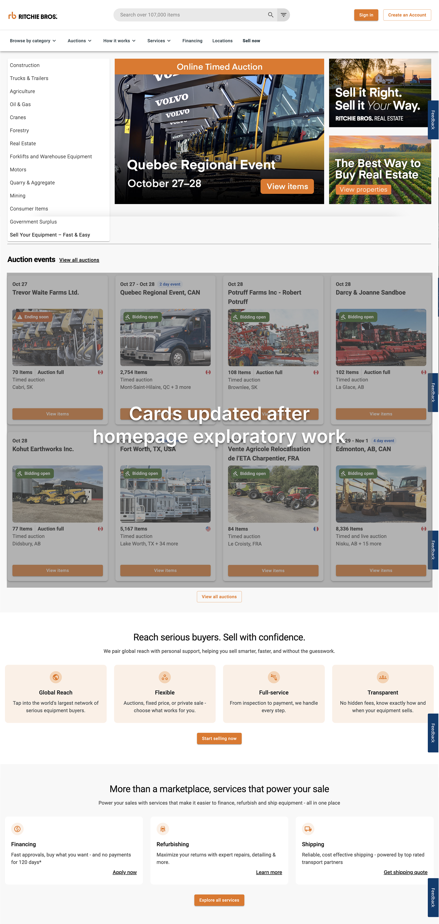
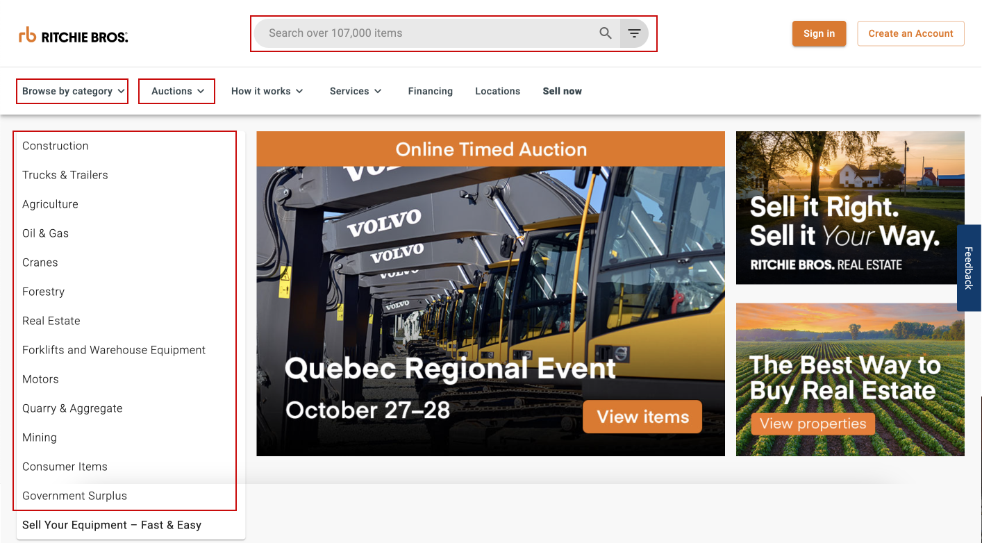
Primary navigation items selected by users (besides promo area)
Requirements
The new design had to achieve the following:
work well across all breakpoints (this included getting rid of the third party feature area)
offer the user more relevant results
make it easier for logged-in customers to jump back into previous searches or activities
offer new ways for users to explore available items (e.g. selling today, items in your area, etc.)
maintain or improve the SEO performance for industries and categories of items offered
give marketing the same number of featured/customizable areas or more
give marketing the ability to feature equipment sellers
promote complimentary services offered by the company
Process
I started this project by conducting some market research into how other companies inside and outside of our industry were creating personalized entry points for their users. Some things that I focused on were:
re-engaging users in previous activities (continue shopping/watching, buy again, etc.)
completing user enrolment (filling out profiles, adding billing/address info, abandoned carts, etc.)
framing of personalized recommendations
The next step was to begin drafting wireframes to ideate different layouts. When creating wireframes I start at a very low fidelity, using grey boxes and labels to identify the different types of content in the layout, and gradually add more detail like titles and placeholder copy before moving to the mockup stage with the preferred layout.


The process used for this project was slightly different, however, because marketing was heavily invested in the design of the page. We chose to present our preferred concept much earlier in the process so we could collect their feedback on it and help them feel they were involved in the design process. After deciding on the preferred wireframe, I dropped in placeholder images and text so that they would have a more realistic visual of what the final layout could look like.
When presenting the concept to the marketing executives, I knew how the concept was framed would be really important in order to get them on board, especially because the concept would get rid of their primary promoting real estate (the third party feature). With that in mind I set up an introduction that explained:
the designs were not final and any copy or photos were there to give them an idea of what it could look like
the designs leaned towards a “blue sky” vision and did not necessarily reflect what was technically feasible at this time
feedback we were and were not looking for at this point in time
The rest of the presentation included going over, in detail, the different content areas on the page for logged-in users, the differences in content for unknown/new users, and what the layout looked like on mobile screens.
Concept Presentation

I also included versions of the concept that showed with overlays what content would use personalization data from users (purple), and which areas would be able to be customized by marketing if they wanted to override the personalized default shown to users (orange).
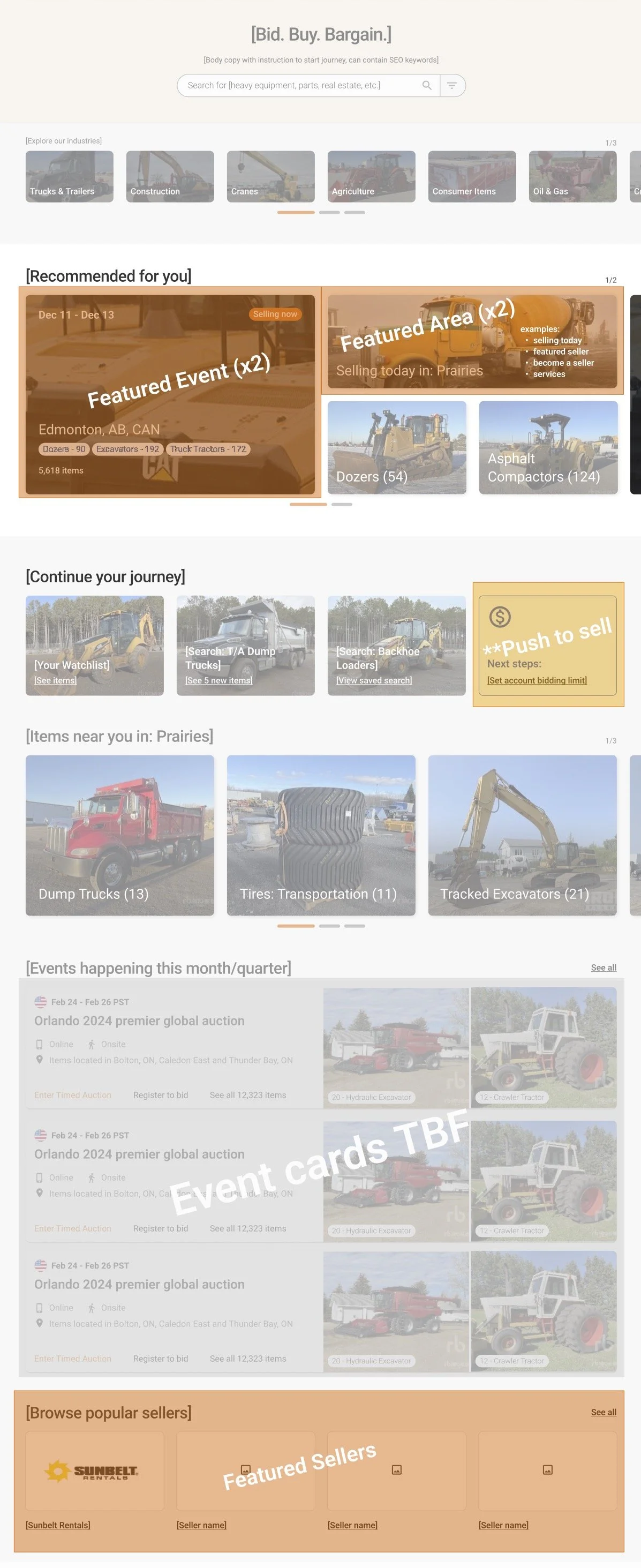

Key improvements in the proposed design:
industries shown with image tiles to lessen mental load on users who may not be familiar with what equipment belongs in an industry (order of tiles would be personalized based on browsing and purchase history)
“Recommended for you” area has eight different jumping off points personalized for users, but two on each page can be customized by marketing, giving them extra space to feature content
“Continue your journey” section provides easy jumping off point for users to resume previous activities, and also allows us to nudge them towards completing their profile so they can purchase items if needed
“Popular sellers” area gives marketing a dedicated space to feature multiple sellers instead of needing to use space above for just one
Results
Following the presentation of the concept the feedback was minimal and largely positive.
The biggest piece of negative feedback focused on featuring the search bar so prominently above the fold, and the basis of this feedback largely came down to personal preference. I had originally thought that featuring the search bar as the primary action when users arrived on the homepage would provide a more direct route for users to get to a results list that was the most relevant to them if they had a particular item or event in mind. However, after speaking with the product manager for the search team I found out that this might end up frustrating our users due to the current state of our indexing. Based on this information I chose to keep the search bar display as is, and move the content below up to the top of the page.
This also helped to address the other concern shared, which was how far down the page the event cards were displayed.
Unfortunately, before I was able to refine the concept further, this work was de-prioritized. Some elements, such as featuring a user’s watchlist items on the homepage, were able to be implemented as quick wins without completing the full design.
Disclaimer: The content shown in the images is not real and has been subbed in to protect proprietary information.