
Agency: Nourish Food Marketing
Challenge
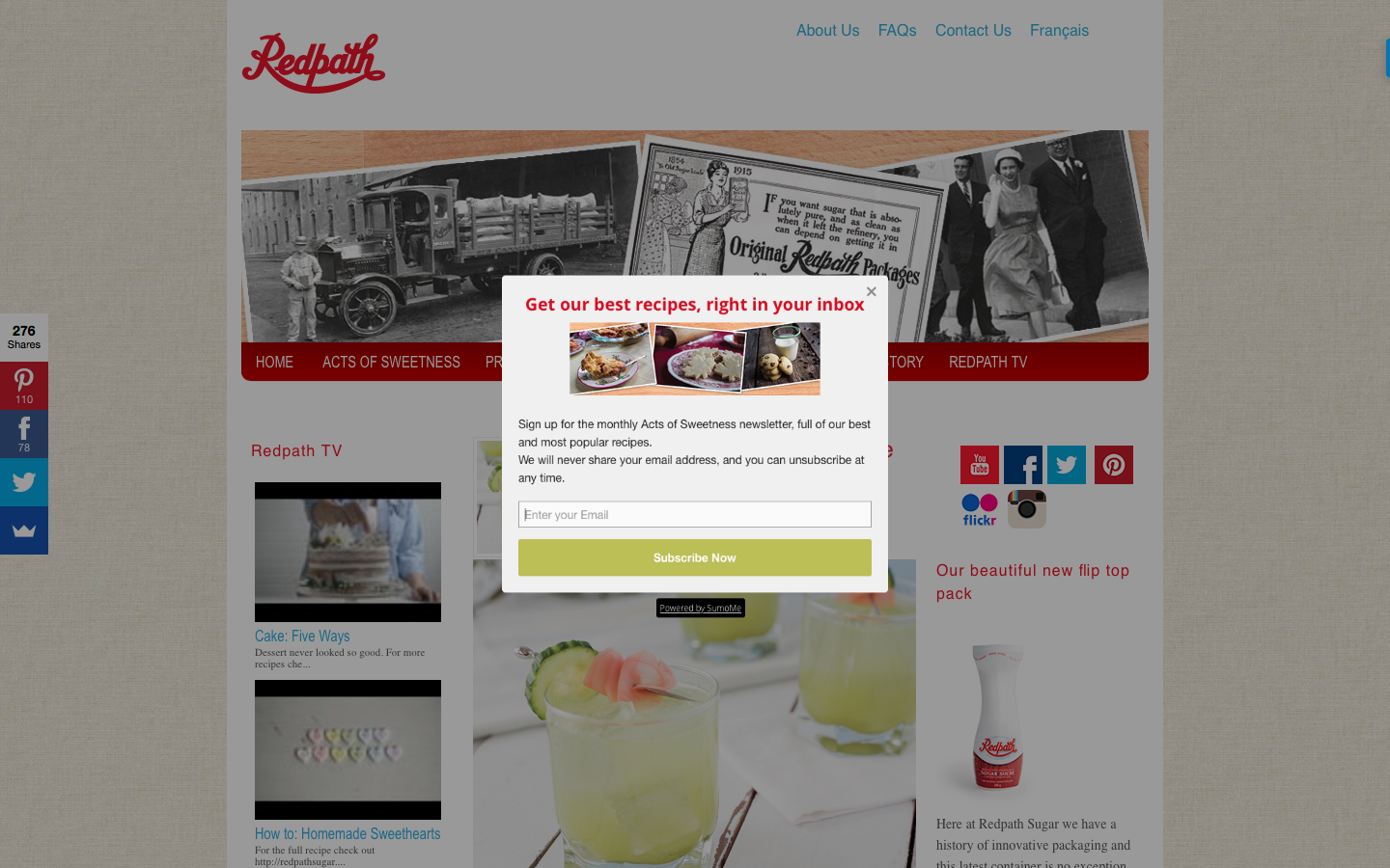
Outdated aesthetics and poor functionality
Redpath had been a client at the agency for a number of years and over that time our team had become increasingly aware of problems with the website. There were multiple issues that resulted in poor user experience (a badly structured information architecture, no search function for the recipes, a pop-up prompt to sign up for the newsletter that appeared regardless of whether you were a new visitor or a returning one that had already signed up, poorly displayed videos, etc.) and the overall aesthetic of the website was outdated and didn’t reflect the current brand displayed elsewhere. Since the agency had encountered some resistance in the past when they had proposed redoing the website, we decided to create a two-page prototype to show the client what we wanted to improve and how it could look to help get their buy-in.
Research
The agency’s employees were frequent users of the Redpath website, both the front end and the back end so the we asked them to create a list of all the issues and frustrations they had with the website during their use of it as well as anything else they thought we should change. We used Google Analytics and the information gathered from social media accounts to find out what content users were most interested in and specific problem areas on the website. We also researched competitor sites to see what kind of functionality, content, and information architecture they were using and how well it worked in addition to looking at the different aesthetics presented and how well they represented that brand.
After collecting the list of issues about the site and conducting our research about competitors, the we got together with our coworkers who were most involved with the Redpath account to go through and discuss the issues on the list. By the end of the meeting we had prioritized the issues that we wanted to solve based on what our users needed and had made a decision on the direction we would (ideally) like to take the brand in the future.


Process
After determining which issues were the highest priority and the direction we wanted to take the brand, I created three options of wireframe layouts for the home page and a recipe page that solved the issues we wanted to fix. We chose a layout for the home page and the recipe page for which I then designed the UI, with a few adjustments to the wireframe elements.
When designing the UI, I used pre-existing content from the site as we weren't changing the kind of content on the site but reorganizing what was already there and bringing what the users cared about to the forefront. I then exported the mockups into InVision to mock up a few choice interactions that the we felt were important to show to the client.


Solution
Our proposed redesign kept all of the same information that was previously shown on the website but placed a much higher emphasis on photo and video content, reducing the amount of text on pages where it was possible, and breaking any text up into digestible portions. Since recipes were the content users were most interested in viewing, we placed them front and centre on the homepage and implemented a search bar for recipes right into the navigation menu so that it became extremely easy for users to browse and search for them. The redesigned information architecture resulted in a pared down, and more intuitive navigation menu, making it easier for users to find information about the company, its products, and its newest content.
The recipe page breaks out important information about the recipe (such as cooking and preparation time, and ingredients) into a sidebar so that it’s visible and easy to find in the middle of making a recipe. The ingredient list becomes fixed to the top of the screen when the user scrolls through the instructions so that they can easily check ingredient amounts without having to scroll back up to the top of the page. It can also function as a checklist, helping users keep track of which ingredients they’ve already mixed in. We made the numbers in the instructions much larger, heavier, and made them red so that users are able to find their place much more quickly after looking away from the instructions.
Result
Our client really liked the proposed redesign when it was shown to them, however they were unfortunately unable to get approval from all the necessary stakeholders to proceed with the project.
**Update**
After I left the agency the client ended up going through with the website design. They incorporated some of the key features that I included in this project (sticky ingredient list, search function, greater emphasis on images and videos, better organized information architecture).